The goal of this typographic project was to create a two-color book that compares two fonts.
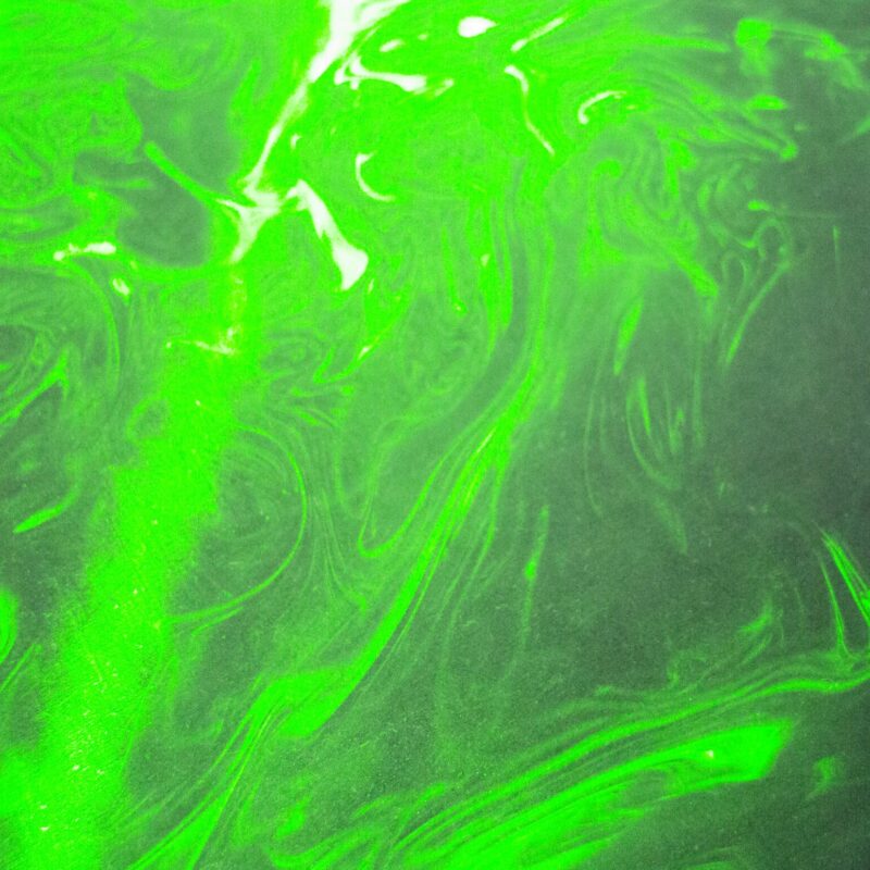
Since we lotted two very similar fonts with ‘Frutiger LT Std’ and ‘Maison Neue’, we go into great detail during the analysis. Especially overlays proved to be useful. We superimpose blue and yellow for illustration in the design and thus additionally create a bright green.
After presenting the fonts in type specimen, we started with a wide range of readability tests, from different font styles and sizes, line and character spacing to blurring.
Further sections deal in detail with the characteristics of the script, the authors, the context of its creation and the public use of the scriptures. Finally, we present various application examples.
Typography project FaceToFace supervised by Jenny Bease & Anja Kaiser

Cooperation with Magdalena Neynaber

second bachelor semester industrial design


